
Designing for low vision: how Radio NZ improved
Radio NZ’s website had a severe accessibility issue which impacted low vision users. Here’s how it improved.
RNZ website had a redesign
In June 2026, RNZ announced a redesigned website.
I was pretty excited to see this; RNZ is my favourite news website because it’s historically been the most accessible news website for someone like me, with vision impairment.
But, there’s a problem
I tried increasing the font size of the text, and noticed that headlines became truncated, and were therefore unreadable. It would be impossible to tell which stories you wanted to read, because the headlines were incomplete.
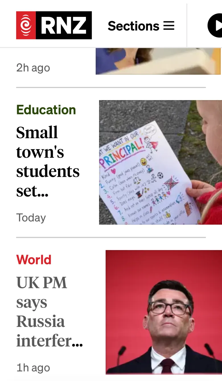
A complaint from yours truly…
In response I wrote a complaint to RNZ, but after a couple of months the issue persisted.
After some, uhh… strong constructive feedback from me on LinkedIn, the issue got prioritised and resolved.
The result is much better. People with vision impairment can now increase font sizes more on the RNZ website on their smartphone, and read the news.
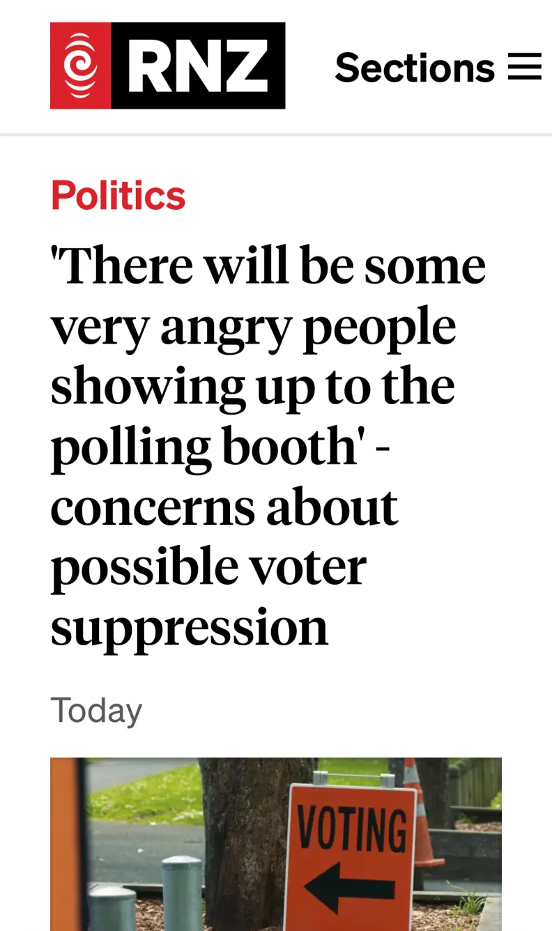
How could this bug have been detected?
A really basic, quick check nearly anyone could do is:
- Load the website on your phone
- Find the zoom control in the browser
- Bump up the zoom to 200%
- Check everything still works.
On iOS, sadly Apple has made the zoom controls in Safari very difficult to find, and it’s impossible to tell what zoom level you’re at. For some reason, Apple’s design appears to be getting significantly less usable recently.
What did we learn?
You need human experts to catch issues
Firstly, when redesigning a website, it’s really important to ensure you have accessibility experts involved.
AI would not have caught this kind of bug; it needs actual human experience to understand how blind and vision impaired people interact with the web.
Have good complaint processes
I am probably one of New Zealand’s most prolific accessibility complainers.
I probably submit at least 1 complaint per week about a service I struggle to use due to non-accessible design. It’s exhausting. It takes so much effort to carefully identify, write up, and explain each accessibility issue I find. I’m doing a huge amount of free work on behalf of these companies.
So when your organisation does receive a complaint, it really ought to take it seriously, and get it resolved ASAP. Unresolved accessibility complaints can escalate, and get worse — they can even end up in the justice system through a human rights complaint!
In the case of RNZ, the complaint process didn’t work properly. This can leave disabled people feeling frustrated and ignored. It means whatever barrier they were facing just continues to persist, locking them out of accessing your digital service.
Complaint processes are a crucial part of UX. Sure you might have a 20-something-year-old with perfect 20/20 vision clicking around Figma and you think that’s UX sorted. Part of user experience design is actually listening to, and responding to the human beings who use your service.
If you run a web team and you’re not watching the complaint system like a hawk, you’re not doing UX.
Oh, and make sure there’s a clear accessibility complaint process. It should be findable with a quick Google search or AI prompt; not buried in a 10,000-word webpage.
Accessibility is fragile
While most people may have been celebrating a website redesign, I was feeling really sad and worried because the daily news was getting even harder for me to access.
Accessibility is far from a solved problem. I’d say with the rise of vibe coding, software bugs have been getting more frequent and worse — accessibility is no exception.
Disabled people like me are one insignificant bug away from being shut out of accessing basic services like the news. So, I argue it’s more important now than ever, to involve expert humans in the design and development of critical software.
— Callum