
Autoplaying homepage videos: don’t do it
Sadly a trend is sweeping Aotearoa’s web design agencies which makes websites unbelievably difficult to use. Enter the horrors of: the autoplaying homepage video.
What’s the problem?
Over the past couple of years I’ve noticed a common design pattern amongst “trendy” new websites. Autoplaying videos. Everywhere. It’s like a plague sweeping the design agencies throughout Aotearoa; if you don’t have a homepage autoplaying video, you’re not cool. Unsurprisingly, autoplaying homepage videos create significant accessibility and usability barriers.
In this post, I’ll walk you through my reasoning on why we need to ditch this tacky design trend.
It’s (usually) against WCAG
So, the Web Content Accessibility Guidelines (WCAG) have a relevant Success Criterion here, 2.2.2 Pause, Stop, Hide (Level A).
Pause, Stop, Hide is a Level A criterion; so it’s considered very essential and basic in terms of WCAG compliance.
Pause, Stop, Hide basically requires the following:
- for auto-moving content,
- that lasts longer than 5 seconds,
- that is presented alongside other information,
- there must be a mechanism to pause, stop, or hide that moving content.
So, many of the autoplaying homepage videos fail these requirements — most play for longer than 5 seconds, and many lack a pause button.
But WCAG is the bare minimum
I personally recommend going further than what WCAG requires in this instance.
Autoplaying video can be terrible for many users, including:
- people who experience nausea or dizziness when seeing motion
- people who may experience seizures if the video flickers
- people who have ADHD, or reading disabilities, who may struggle to focus on and understand text when video is playing behind it
- people who have vision impairment and struggle to see text, particularly with moving backgrounds
I could probably list several more categories of people who are impacted negatively by autoplaying video.
Now, why on Earth would we choose a design that could make our users feel sick? Now, perhaps I’m being a bit controversial here, but I think if a design makes your users feel physically ill, it’s probably a bad design.
Colour contrast failure is common
A failure state I often see is of WCAG Success Criterion 1.4.3 Contrast (Minimum).
Often there will be white text in the header and main navigation area, and the video will be playing underneath this text. As soon as a white cloudy sky, or anything light-coloured is in the top region of the video, the text becomes practically impossible to see — triggering a text contrast failure, which makes the website hard to use for people with vision impairment.
Ensuring people can see your website’s main navigation and header is rather important — we shouldn’t accept basic colour contrast failures here.
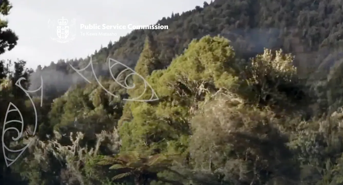
Nerd note 🤓☝️: Um, akshully, WCAG colour contrast requirements don’t apply to logos! But, use some common sense! A logo is commonly conveying important information about what website you are on — making it practically invisible to users is a spectacularly bad design choice.
Let’s take a tour of the autoplaying web
How much of a problem is this? Well, let me take you on a guided tour of modern web design in Aotearoa.
Tour stop one: Te Matapihi
Let’s first check out the Te Matapihi website. This is the freshly-minted Wellington library website. Now, at the time of writing, upon opening this website I’m immediately dazzled by slow-motion fluorescent confetti exploding in my face.
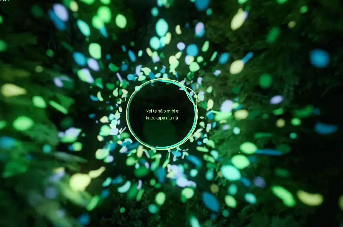
Now, ask yourself this: why would someone want to visit the Wellington library website?
- to watch glowing globules of plutonium threateningly drifting towards them? No…
- to watch timelapse videos of people inside the library? No…
- to have interface components fly around my screen in response to your mouse movements? No…
It’s to get basic information about the library!
Things like location, opening times, events, etc. It doesn’t have to be complicated, or cost literally $600,000.
Tour stop two: Public Service Commission
When you load up the Public Service Commission’s website, you’re immediately subjected to an autoplaying video of someone walking through the forest.
Now, this one does technically comply with WCAG SC 2.2.2 Pause, Stop, Hide, because there is a tiny pause button hidden in the bottom-right of the interface. But, is it really a good user experience to ask all people who experience motion sickness to search around for the pause button before they 🤮?
No! It’s not good design! People should not be at risk of being adversely impacted by a design, even if there’s technically a pause button somewhere.
Good design should be about respecting the users we aim to serve, not allowing our aesthetic preferences to dictate who can, and cannot, comfortably use the website.
Think about the function: why do people visit the Public Service Commission website?
- is it to watch videos of people walking in the forest? …no.
- is it to watch videos of dudes sailing their boats around? No!
It’s to get basic information on what the Commission’s up to!
By all means, have some cool videos that demonstrate what public servants get up to day-to-day, but chuck that on TikTok/YouTube and ensure people watch it because they want to watch it, not because it’s sprung upon them at page load.
Tour stop three: Let’s run to the Human Rights Commission! Oh…
One of the more fascinating examples is the Human Rights Commission. Their new-ish website takes a whopping 13 seconds of unskippable animations to load.

Honestly, I encourage you to go to the Human Rights Commission website and take a look, it’s a good laugh. Or cry. Or both?
I’ve always been astounded by how badly this website is designed. It subjects users to an astounding amount of unavoidable animation, which is particularly problematic, because accessible digital services are a literal human right, and, uhh, how do I put this… the Human Rights Commission is responsible for human rights!
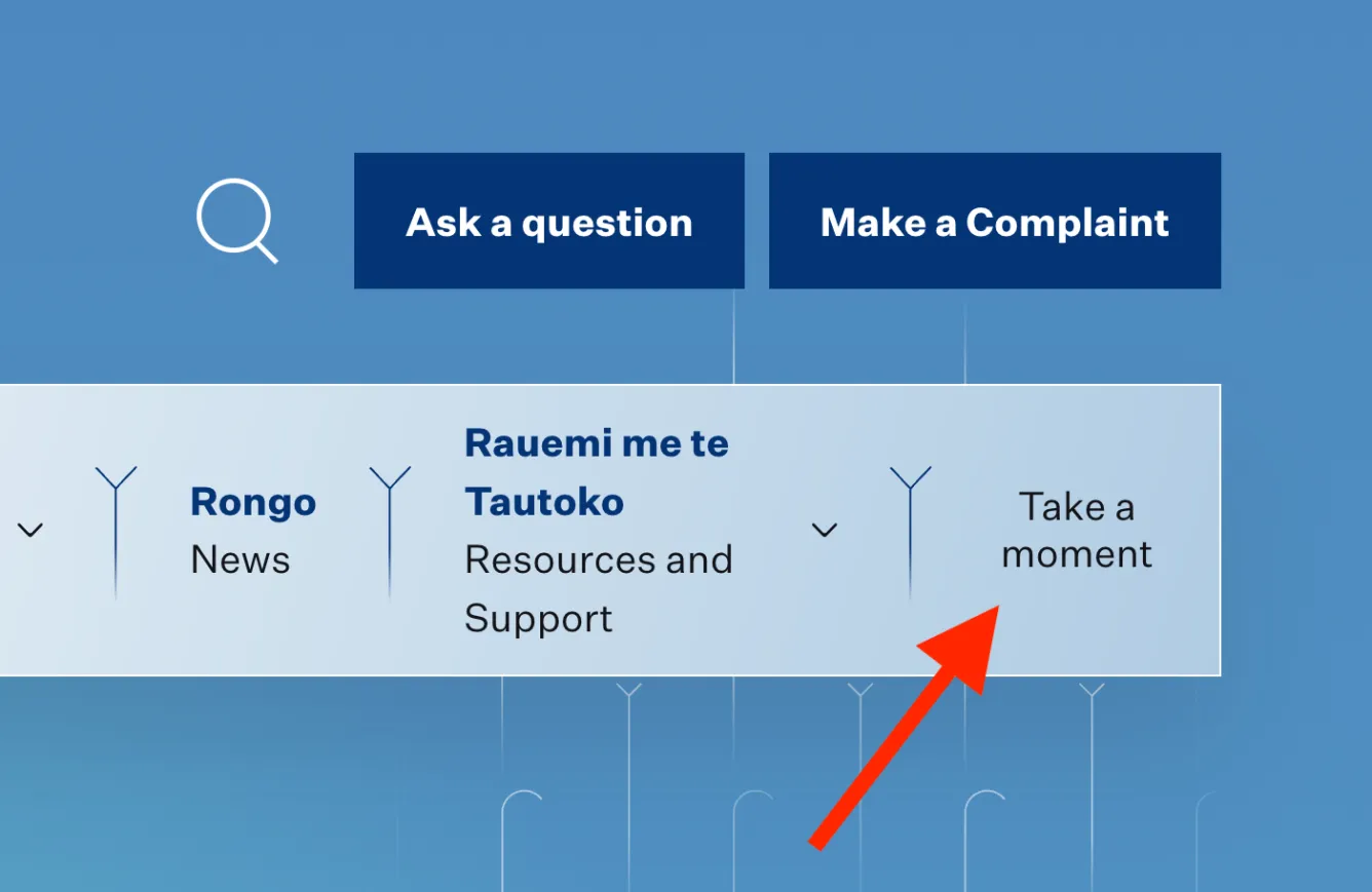
Once you’re done contemplating the deep, unsettling irony of this website, you might need to meditate for some time to recover. To assist you with this, I encourage you to click the “Take a moment” link in the site’s navigation. I kid you not, you will be delicately soothed with a webpage which plays mystical synthesisers and sparkly wind chime sounds, while continuous lines and colour changes are presented visually.
My core lesson: form follows function. No exceptions.
I want to hammer home this design principle: form follows function. That means, the way we design systems should first nail down the way things work. We should ensure the intended audience can actually use the systems we’ve built. Then, we can make it look ✨ pretty ✨ within the confines of a functional product.
Designers seem to be forgetting this essential design principle, and allowing visual aesthetics to dominate. Design isn’t actually about making things pretty. Design is about making things work, then making them pretty.
One time, I had a designer say to me “Oh, but accessible design is ugly!”, I recoiled in horror then immediately spat back “Well, discrimination is even uglier.”
Accessibility and beautiful design are not in conflict. Design is all about working within constraints. If you can’t make an accessible design beautiful, that’s a skill issue.
Okay, we get it, Callum, you don’t like autoplaying videos. Then what?
The solution is simple.
- Delete autoplaying videos off your site.
- Attend a local place of worship to ask for forgiveness of accessibility sins (optional).
- Use still images instead of autoplaying videos.
- If you want video, disable autoplay. Add a play button.
- If you need an example, just look at this site’s homepage.
Better living, everyone! 👨🍳
— Callum